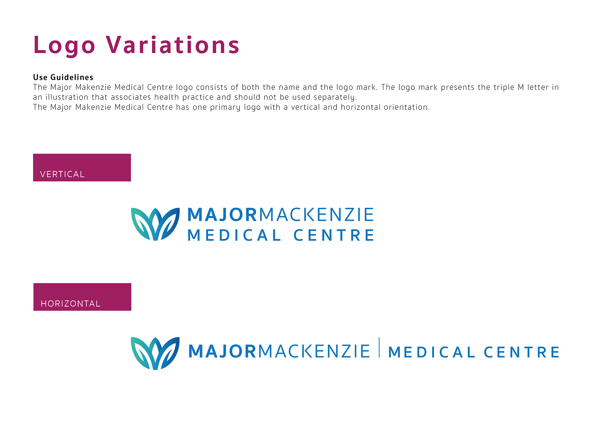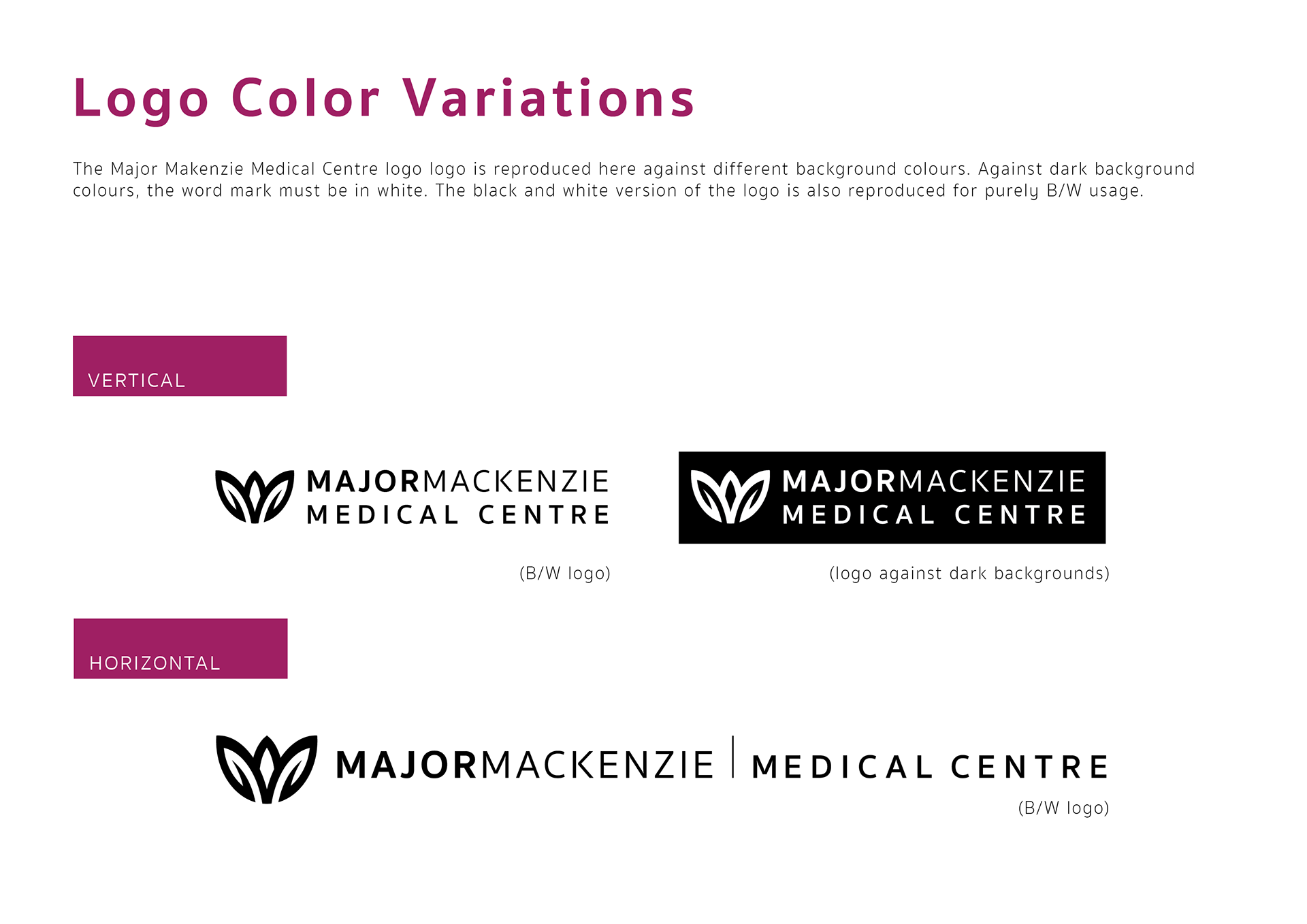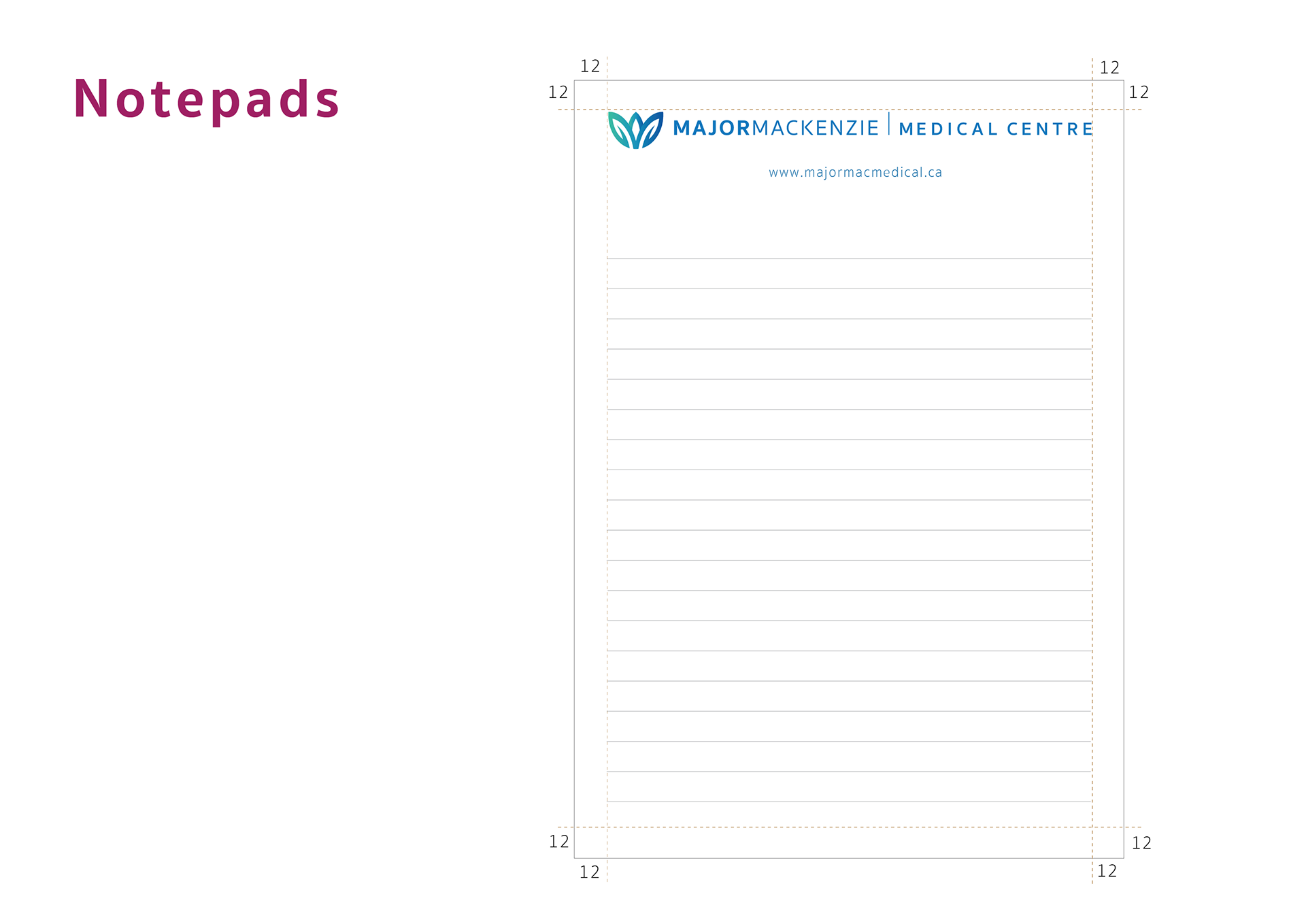
The goal of this project was to provide branding and design to communicate exceptional quality of healthcare services to patients. It is a trusted brand, and the aim was to reinforce that sense of trust. The logo consists of the name and logo mark. The logo mark consists of a stylized triple M, an echo of the company name, while also reminiscent of a plant in bloom, signifying health and vigour.