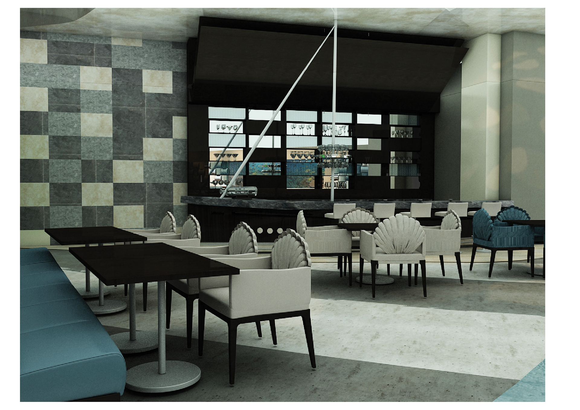
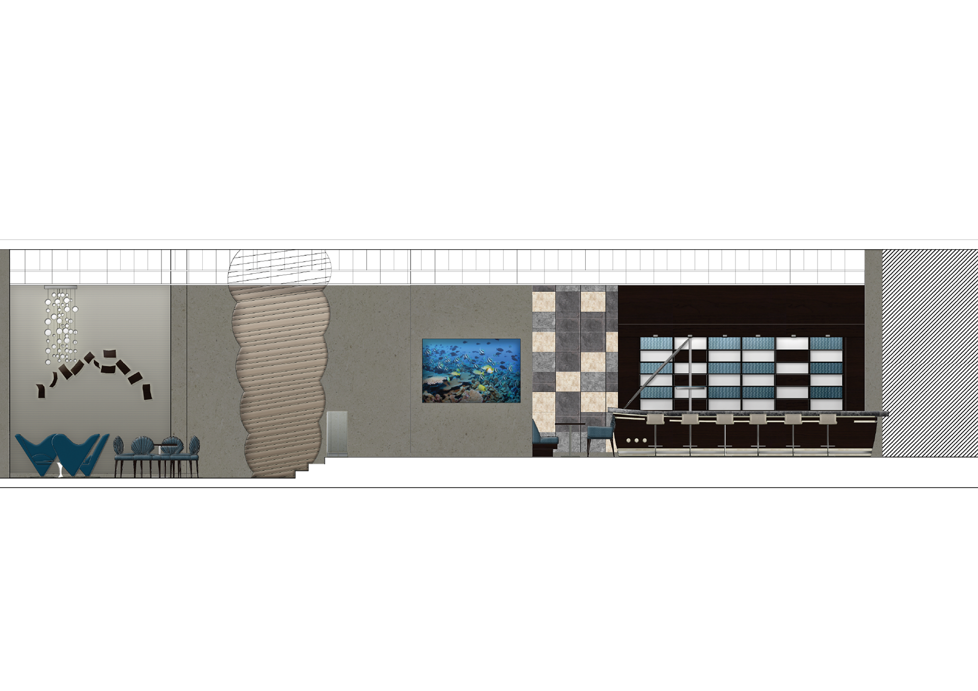
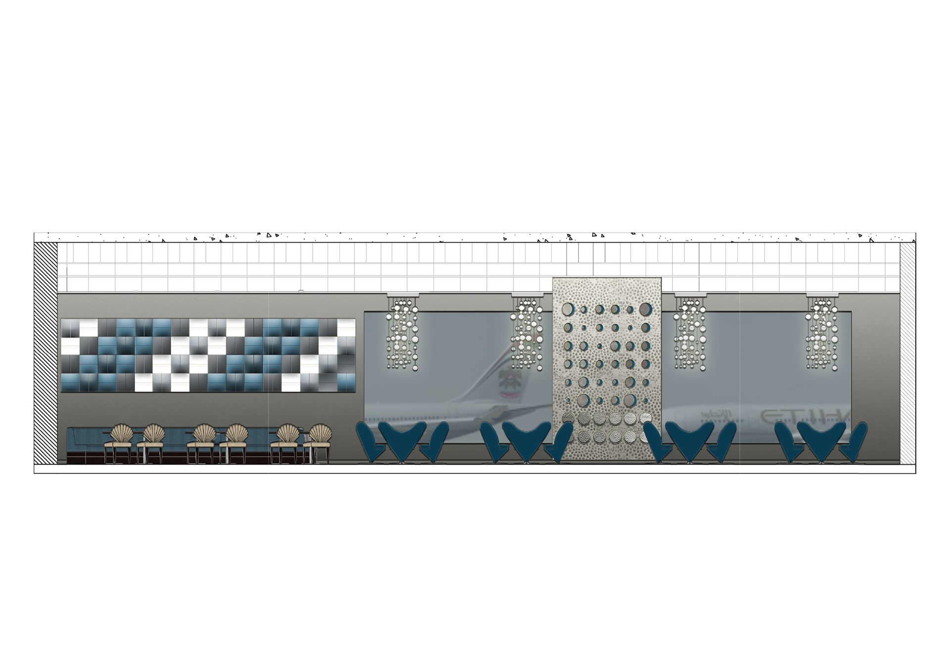
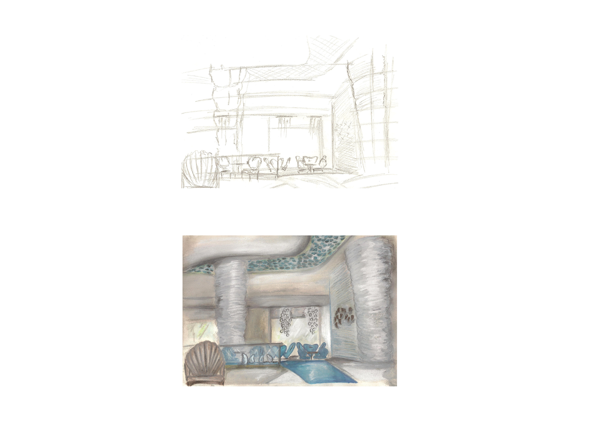
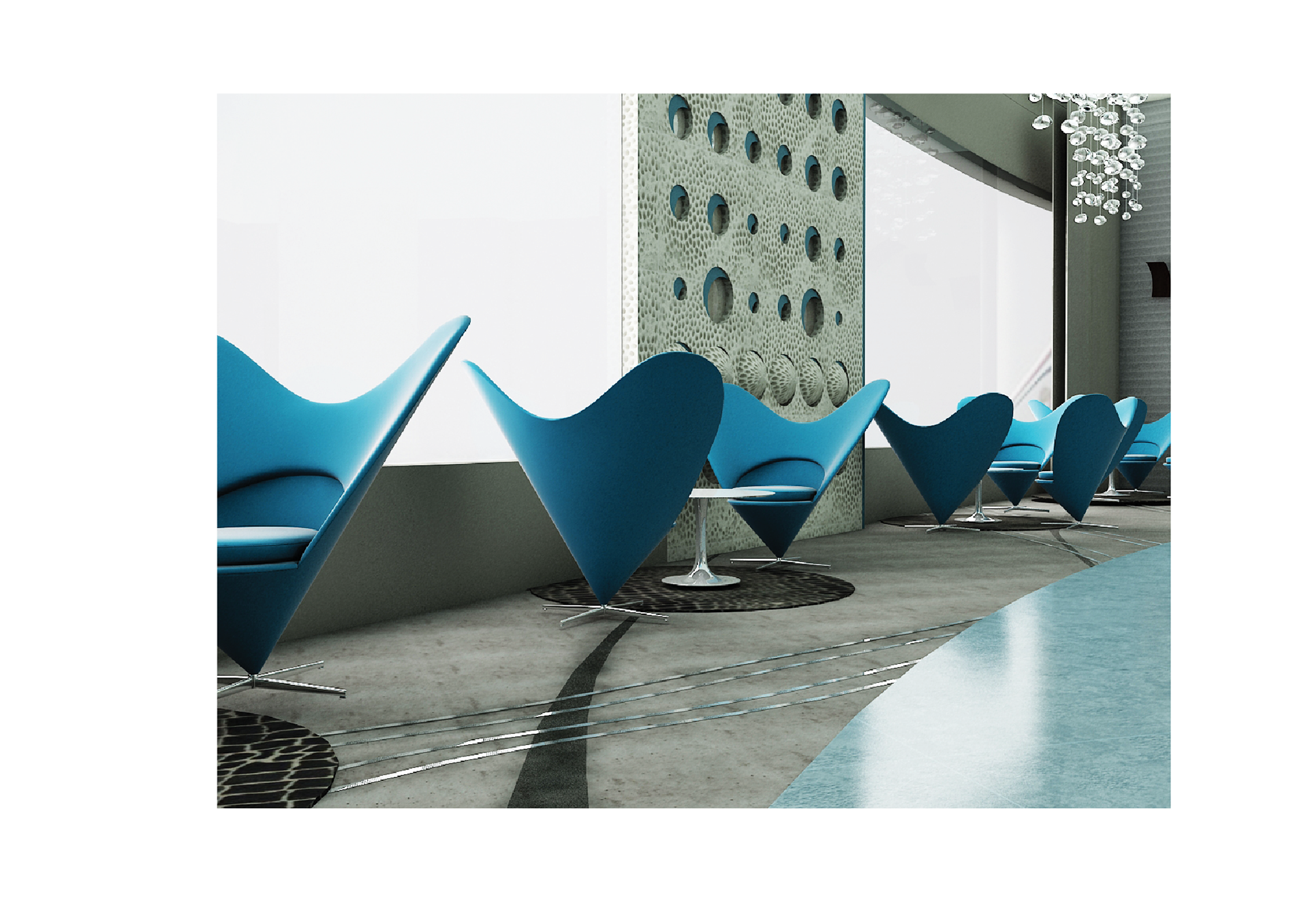
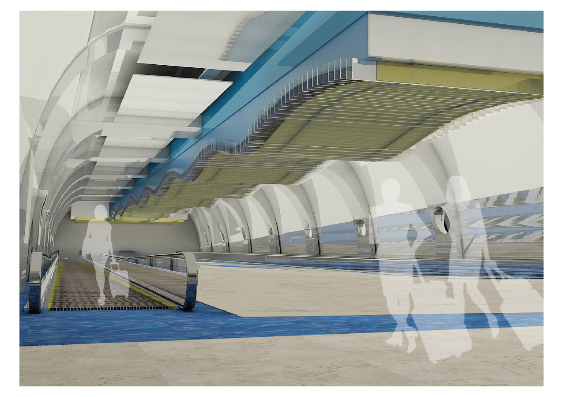
The existing lounge area could not handle more capacity as the number of passengers using the space increased. There was insufficient seating for passengers, many of whom were waiting long hours in the lounge in transit. The goal is to increase seating and change the seating arrangement to enable better passenger and staff circulation. The lounge was redesigned and a restaurant was added to the least-used part of the space.
The goal is to redesign the entire passenger experience by making it easy for them to find their way to their gate, and providing opportunities to eat, shop, and relax along the way. Important features were integrated directly into the design, such as way-finding and graphics. As a high-traffic space, airports may be considered one of the most stressful places for many; the design and colour scheme was inspired by the ocean, using the colours of sand and shades of blue to give a relaxing and calm experience for the passenger.


